Ever walk into a small room and feel like the walls are inching closer? Paint can’t move a wall, but it can change how your eyes read the space. The right paint colors small rooms need can make corners soften, ceilings lift, and tight layouts feel calmer.
This guide breaks down what actually works, from LRV (how much light a color reflects) to undertones (the hidden tint that shows up after it dries). You’ll get practical color directions, copy-and-paste palettes, and quick rules for tricky rooms like dark basements and wood-heavy homes.
Start with Light: LRV Matters More Than the Color Name

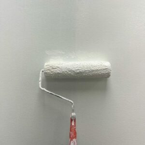
Photo by Nataliya Vaitkevich
LRV stands for Light Reflectance Value. In plain terms, it’s a score that tells you how much light a paint color bounces around the room. Higher LRV usually helps a small room feel more open, because the walls don’t “absorb” the light the way deeper colors do.
A few simple rules:
- Low-light small rooms usually look best with mid to higher LRV colors, so the walls don’t go flat or muddy.
- Super-bright whites can work, but they can also feel sharp in a small space if the undertone is wrong.
- If you want a deeper vibe, choose a dark color with intention (more on that below), and keep the finishes and trim working for you.
If you want a deeper explanation of how LRV impacts a space, this overview is helpful: what Light Reflective Value means for paint colors.
Undertones: The “Secret Ingredient” That Makes a Room Feel Fresh (Or Off)
Undertone is the subtle color hiding under the main color. Two paints can look like the same “light gray” on a swatch, then one dries blue and the other dries green.
Quick rules of thumb that keep small rooms from feeling weird:
- Go warmer (creamy whites, warm greige, soft beige) when the room faces north, gets little sun, or has lots of cool daylight.
- Go cooler (soft blue-gray, pale green-gray) when the room gets strong warm sun, or when you’re balancing orange-toned materials.
- If your home has warm wood (oak cabinets, honey floors, cedar trim), avoid icy grays. They often clash and make the wood look more orange.
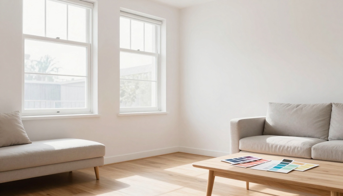
Before you commit, paint two big samples on different walls and check them morning, afternoon, and night. Small rooms change fast with lighting.
For more small-space color inspiration, these brand guides are handy reference points: Sherwin-Williams paint colors for small rooms and Benjamin Moore small room paint color ideas.
8 Paint-Color Directions That Make Small Rooms Feel Bigger
These aren’t brand-specific, so you can match them in any paint line. Focus on the direction (depth, temperature, undertone), then test.
- Soft warm white (not stark): Brightens without feeling clinical, great for hallways and small bedrooms.
- Creamy off-white with a hint of yellow: Warms up low light and plays nicely with warm bulbs.
- Light greige with a gentle green undertone: Quiet, flexible, and forgiving, good with mixed finishes.
- Pale taupe (warm gray-brown): Adds depth without shrinking the room, especially with white trim.
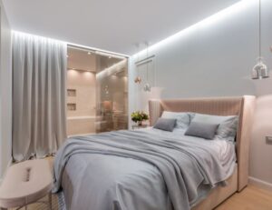
- Misty blue-gray: Makes walls recede visually, helpful in narrow rooms that feel boxed in.
- Dusty green-gray (sage-leaning): Softens corners and looks natural next to plants and wood tones.
- Blush-beige (pink undertone, very subtle): Surprisingly flattering in powder rooms and small offices.
- Light clay or sand: A modern warm neutral that hides scuffs better than plain white.
If you’re stuck choosing between two options, pick the one that looks slightly boring on the swatch. In a small room, “calm” reads as “bigger.”
Use Contrast the Smart Way (Walls, Trim, and Ceiling)
Big contrast can chop up a small room. Low contrast usually stretches it.
A few approaches that work well:
One-color look (walls and trim close in color): Painting trim the same color as the walls (or 1 to 2 shades lighter) reduces visual breaks, so the room reads larger.
Ceiling strategy: A ceiling that’s too bright compared to the walls can feel like a hard lid. If you want height, try a ceiling color that’s soft white or a slightly lighter version of the wall color.
Dark accents done right: Dark doesn’t automatically mean smaller. A single dark element (like a vanity, built-ins, or an interior door) can add depth, as long as most surfaces stay light to mid-range.
3 Sample Palettes You Can Replicate (Wall/Trim/Ceiling)
Use these as a starting point, then adjust warmer or cooler based on your light.
| Palette vibe | Walls | Trim | Ceiling | Best for |
|---|---|---|---|---|
| Airy and clean | Soft warm white | Crisp white | Soft white | Small living rooms, rentals |
| Warm and wood-friendly | Light greige (warm) | Creamy white | Creamy white | Oak floors, honey cabinets |
| Calm and cool | Misty blue-gray | Bright white | Very pale blue-white | Bathrooms, offices, north light |
Small Room Problems and Paint Fixes That Actually Help
Low-light rooms (basements, interior bathrooms)
Go lighter, but not icy. Choose a warm white, creamy off-white, or warm greige. In dim spaces, cool tones can turn steely and make the room feel colder.
Rooms with lots of warm wood
Match the wood’s warmth instead of fighting it. Warm greige, taupe, and creamy whites make wood look richer. If you want a “lighter” feel, keep the walls light and let the wood be the contrast.
Narrow rooms and hallways
Avoid strong color changes between walls and trim. A soft neutral with a similar trim color smooths the tunnel effect. If the hallway has doors, painting doors the same as the walls can reduce visual clutter.
Low ceilings
Skip high-contrast crown molding. Keep the ceiling a soft white, and consider taking the wall color up a couple inches (or using the same color) to blur the edge.
What sheen is best for making a room feel larger?
Flat hides flaws but can look dull in low light. Most small rooms do best with:
- Eggshell on walls for gentle light bounce and easier cleaning
- Satin on trim for durability and a subtle highlight
- Flat or matte on ceilings to hide texture
Want Help Picking the Right Color and Getting a Clean Finish?
Color is only half the win. Crisp lines, smooth walls, and the right prep keep light colors from looking patchy. If you’re in St. Charles or the surrounding area, see our interior house painting services and learn more about the team on our Prime Time Painting about us page.
Quick Checklist Before You Commit
- Check the room’s natural light (north, south, shaded, or bright).
- Decide warm vs cool based on the light and existing finishes.
- Look up LRV, then keep options in a similar range.
- Test large samples on two walls.
- View samples in daytime and at night with your bulbs.
- Keep wall-to-trim contrast low for a bigger look.
- Choose eggshell for walls in most small rooms.
- Pick a ceiling color that doesn’t feel like a stark cutoff.
FAQ
Should I paint the ceiling white?
Usually yes, but “white” isn’t one color. A soft white often looks better than a bright, blue-white in small rooms. If you want extra height, use a ceiling color slightly lighter than the walls.
Do dark colors always make rooms smaller?
No. Dark colors can add depth and make the walls feel farther away, especially with good lighting. The risk is that a dark color with the wrong undertone can look heavy or muddy, so sample first.
What sheen is best for a small room?
Most homeowners like eggshell on walls because it reflects a little light without looking shiny. Use satin on trim for durability, and keep ceilings flat or matte.
Conclusion
Small rooms don’t need loud tricks, they need the right light, the right undertone, and a plan for trim and ceilings. When you choose paint colors small rooms respond well to, the space feels calmer and easier to live in. Start with LRV, test for undertones, and keep contrast under control. Your room won’t grow in square feet, but it can absolutely feel like it did.